@Dju@lemmy.world to Europe@feddit.orgEnglish • 1 month agoEurope's population forecast to 2100lemmy.worldimagemessage-square40fedilinkarrow-up196arrow-down120file-text
arrow-up176arrow-down1imageEurope's population forecast to 2100lemmy.world@Dju@lemmy.world to Europe@feddit.orgEnglish • 1 month agomessage-square40fedilinkfile-text
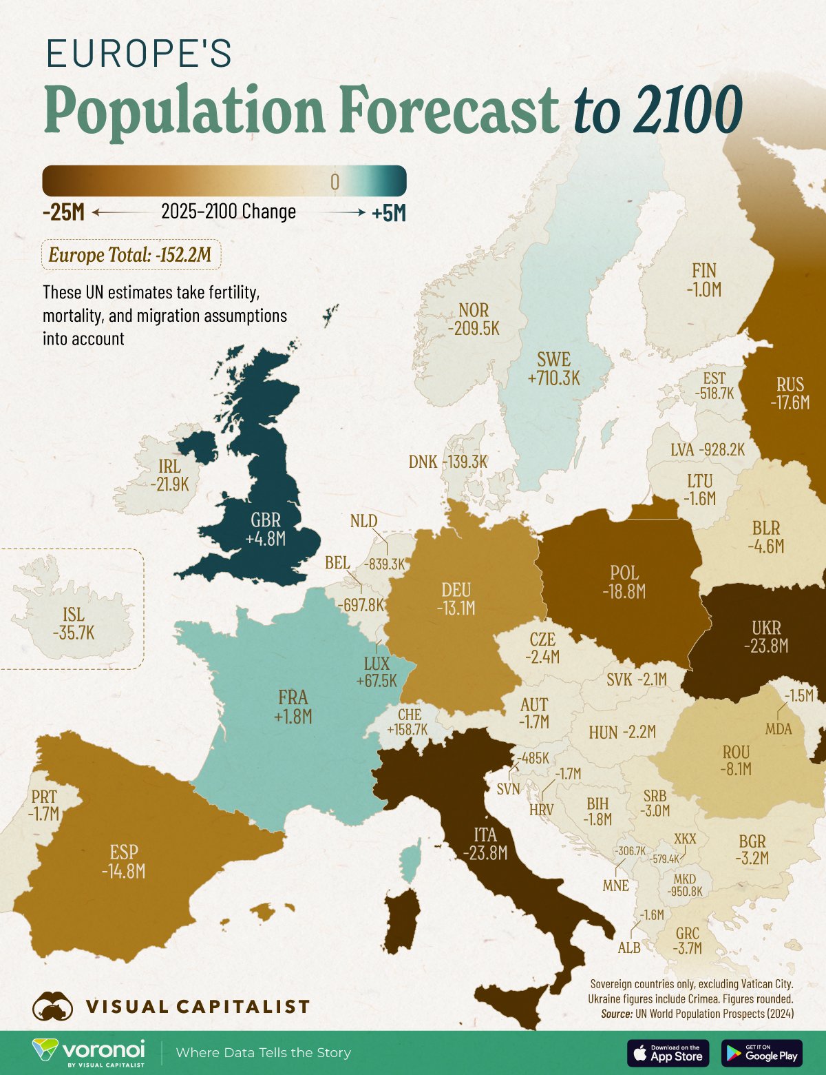
minus-square@widerporst@feddit.orglinkfedilinkEnglish50•1 month agoWhose idea was it to make the color scale absolute instead of relative to the current population?
minus-square@idegenszavak@sh.itjust.workslinkfedilinkEnglish9•1 month agoOn the source there is a table with the percentages, so the creator of the map had that data but they choose to display this nonsense instead: https://www.visualcapitalist.com/mapped-how-europes-population-will-change-by-2100/#tablepress-5264_wrapper
minus-square@Windex007@lemmy.worldlinkfedilinkEnglish7•1 month agoNo kidding. That’s like half of Lithuania. There is a joke they say sometimes, something along the lines of “ok but just remember if you’re the last to leave remember to turn off the lights”
minus-square@5714@lemmy.dbzer0.comlinkfedilinkEnglish6•1 month agoI love that people are beginning to review cartographic methods, I distrust (and love) cartographers.

Whose idea was it to make the color scale absolute instead of relative to the current population?
On the source there is a table with the percentages, so the creator of the map had that data but they choose to display this nonsense instead:
https://www.visualcapitalist.com/mapped-how-europes-population-will-change-by-2100/#tablepress-5264_wrapper
RIP Andorra.
No kidding. That’s like half of Lithuania.
There is a joke they say sometimes, something along the lines of “ok but just remember if you’re the last to leave remember to turn off the lights”
I love that people are beginning to review cartographic methods, I distrust (and love) cartographers.