

Uh, are you geometrically dyslexic?
Yeah these icons are all distinctive
Oh yeah it’s easy to confuse an envelope for a bulbous pin if they’re the same color. I nearly mailed a letter in a turkey baster the other day so I get it
Let me just write down my appointments on this cartoon old-timey video camera
What’s three font used in the heading? Is it some flavour of Helvetica?
My wife really really really wanted a MacBook in 2020 and the major plus is of having it is that I got to steal all the fonts. Mostly, I just wanted Helvetica lol
Grotesk maybe. The curve of “h” doesn’t seem to go high enough. Otherwise pretty close.
Man… I might be showing my age, but checking out some of the links in these replies gave me nostalgia for the website FontsnThings.com (or was it “FontsandThings”?). I used to love browsing that shit as a kid and downloading all the coolest looking fonts lol
Anyone else?
Probably Roboto.
It does not seem to have consistent kerning.
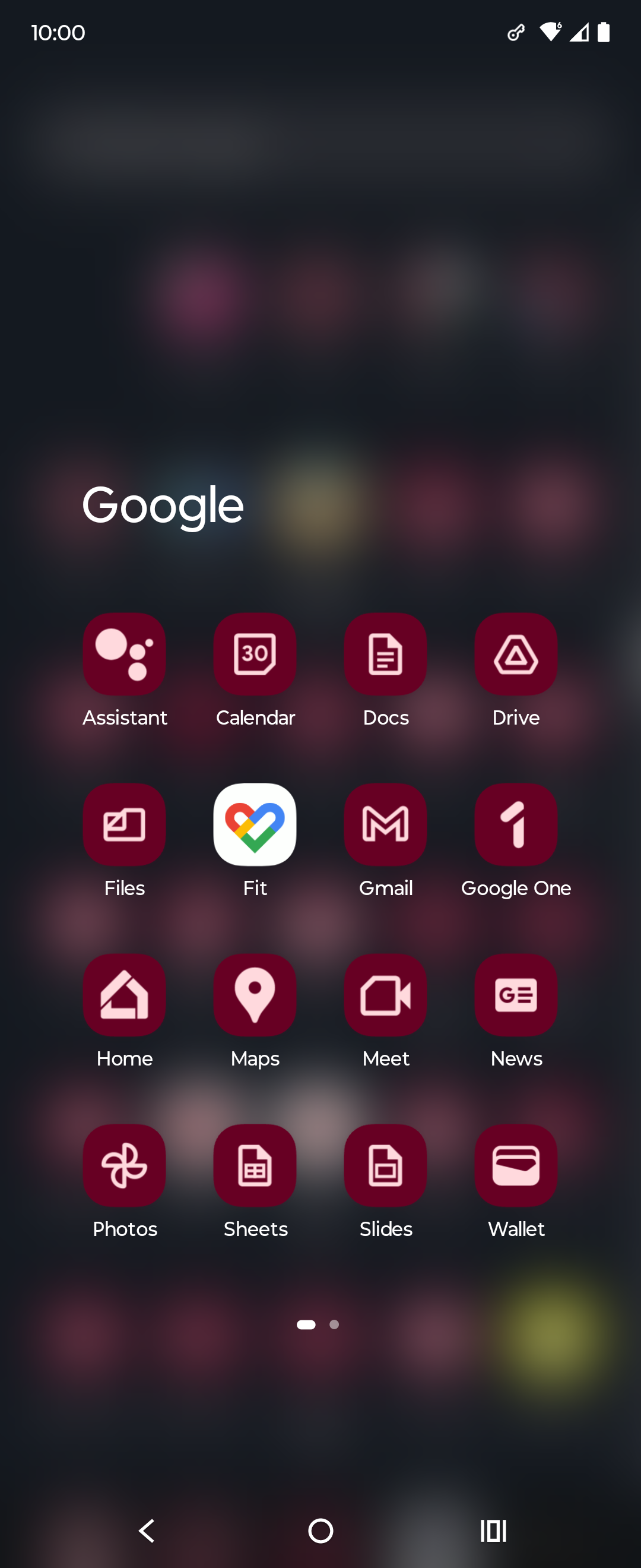
Color is the first thing the eyes tend to notice, then shape, then lines and details. The new icons all look the same at the edge of my vision, I have to look at them straight on to distinguish them. Individually each one is fine but together, like what the hell?
I don’t rawdog Google icons anymore anyway, I use an icon pack
What I keep seeing: $ $ $ $ $
Custom icon packs for the win!
The homogenization of these icons has been a long source of consternation for me.
They’re barely functional as icons; you can scroll right by them and miss them; which makes finding the apps in a list of apps a bit annoying sometimes. Removing each icon’s unique color scheme and replacing it with the ‘company 4 colors’ was the stupidest fucking idea ever.
Even more infuriating is how they keep renaming the applications to unexpected things every so often; so they move around; and it’s dreadfully annoying to remember if they prefixed the name of the app with a G or something else completely different, which renders strict alphabetical sorting a bit moot.
Just had to comment on your elegance and class good sir. Carry on!
Pardon; but I do happen to be a lady; thank you.
Just had to comment on your elegance and class good
sirma’am. Carry on!Yikes with the down votes sheesh. Some redditors snuck through!
It can get even worse. My phone lets me do this to my icons which is ridiculous. I think this was opt-in but now that I’m going through my settings again I can’t actually figure out how to turn it off lol
This is Material You icons; and this is basically not something you can opt out of…that I know of. You may want to find a different Launcher that allows you to load icon packs or disable that Material You behavior. (If yours doesn’t)
Long press the homescreen, wallpaper and style, themed icons
Yeah this is the worst! You know a few designers raised this exact problem during review, too, and were shut down
oh noooo icons sharing a common design language and color scheme? the absolute horror.
if you can’t tell the difference between these icons i have a great educational resource for you
nah I still recognized all of them as google products bc they use the same 4 colors, but in different interesting ways. gmail was all red but a letter shape. Maps was a red pinhead. drive was a triangle but used all the colors but red. Calendar was a less noticeable shape but instantly recognizeable as a tabletop day calendar. now everything has to use all 4 colors and the shapes are so small that the colors can’t do enough on a phone screen to differentiate themselves.
They already had a common design language and color scheme. Now they have a samey-ness to them that takes away visual interest.
Try harder, you can do better than this.
I filed a very irritated Radar / Feedback (Apple’s terms for bug reports) with Apple when the icons for apps all turned to rounded squares. I compared them to Google’s icons and challenged them on making everything harder to distinguish.
I hate contemporary GUI design. Not all of it, but probably half.
I wouldn’t even call this “aesthetics”. Rather “conceptual homogeneity” or something like that. It’s what happens when you strive for a uniform look over a useful or visually pleasing one.
Even uniformity can be aesthetically pleasing, but these icons are decidedly not.
In some countries uniform look at least provided good for society. In this case it provides only profits for to 1%.
Good for society:
I just stopped using most of them
I stopped a time ago. Interestingly, the thing I miss most is maps. That sheer amount of user data paves the path for a fine traffic estimation.
I was yelling about how windows 11 swapped out text listingzs for copy, paste, etc from its contextual menus for stupid icons just the other day. Modern UIs are becoming so “streamlined” to the point of uselessness.
I’ll keep using my favorite icon pack instead, thank you very much
which do you use ? i am looking for a good one
I use Flat Circle. It’s not free, though.
Poppin, Olympia, Cyber, Minima and/or Outline, depending on the mood, season and launcher. There isn’t much left on factory spec with my phone.
God I miss the original Material Design
i see the new icons wanna intergrate googles colors ngl


